Transform boring charts into beautiful information with Stable Diffusion (SDXL)
Transform boring charts into beautiful information with Stable Diffusion and ControlNets

I've spent most of my career getting, storing and neatly organizing data at many different scales in a multitude of industries. Most of the work is usually done behind the scenes and considered routine work.
Querying terabytes in a couple of seconds for some report? Sure, no problem.
From PostgreSQL to Spark, Flink, Hive, BigQuery, Redshift, Snowflake I've tried and used them all. To be quite honest, tools come and go and I appreciate more and more the simplicity of using things like SQL as well as putting more emphasis on how people work together using those tools for a specific purpose, versus using them as an arbitrary best-practice du jour or because some SaaS provider ran some effective ad campaigns.
One thing that fascinates me and interests me beyond all of that is what is actually being done with that data and how people react to it. Let's say you have access to interesting datasets, how do you craft compelling visualizations or tools leveraging that data to convey a message effectively?
In this article I'll walk you through some of the things I tried. Combining many of these techniques will most certainly open up so many new possibilities for displaying data in a novel and maybe more meaningful way.
This practice is called information design. I just think it's fascinating.
Take this graph for example:
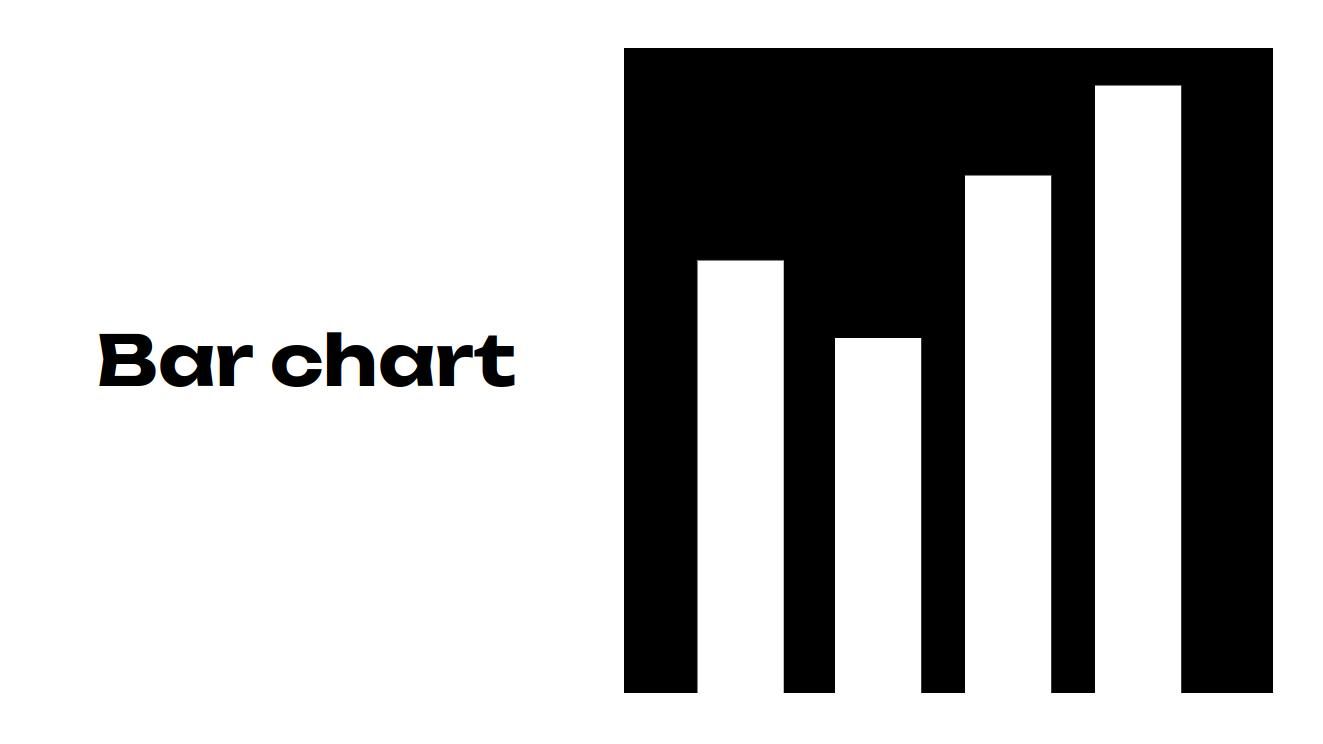
Looking at it this way won't convey much information unless we add axes, labels and more context to it. In this case, consider this:
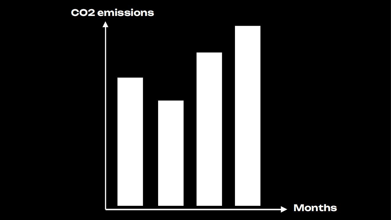
It's pretty clear looking at the graph and analyzing it, that the facts are that CO2 emissions are rising. The data is correct, everything is fine.
However, there is some sort of disconnect between the data and the medium used to display it. What I mean by that, is that the "bars" aren't doing neither the data nor the topic proper justice. We could change the labels and nobody would bother.
They're academic and mainly to inform, not to engage. We're used to ignore those especially when they're surrounded by other, more visually interesting things in our endless feeds.
Cue the generative AI
Let's say now we add another small tool to the mix and use the same black and white bar chart as above as input.
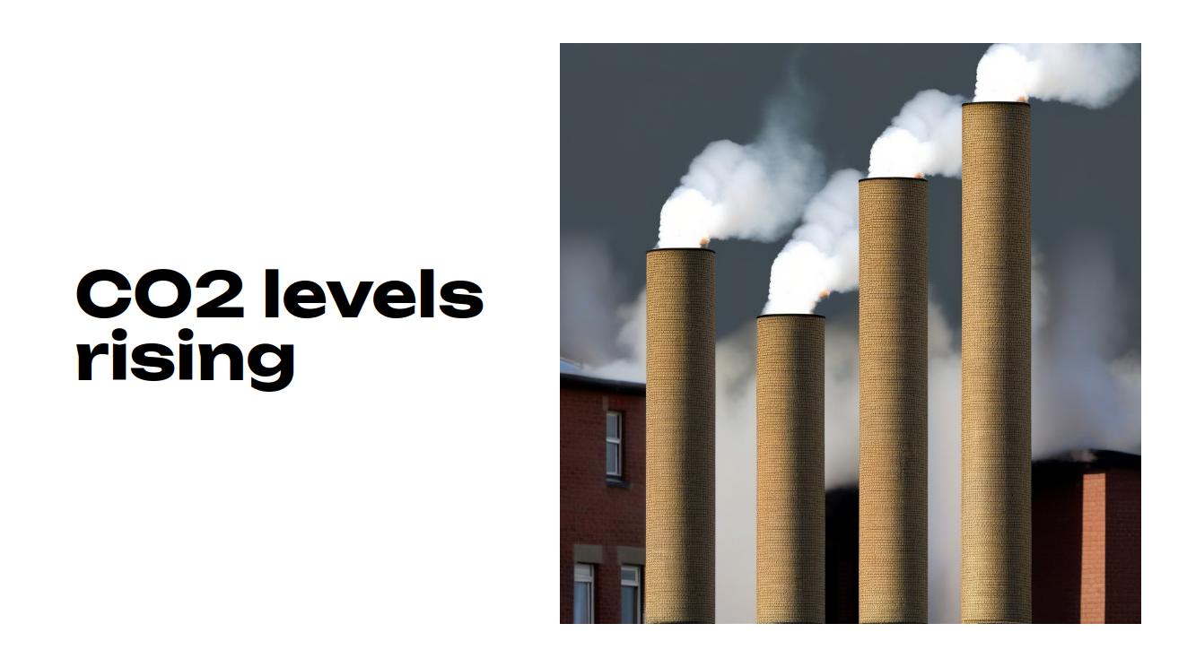
While not being a graph, this image immediately catches you off guard. What is going on? Are chimneys being built taller? Reading the label might on the left gives an indication.
Chimneys are a real thing, picturing them getting taller would translate implicitly to more pollution otherwise why would one need to make them bigger? The image is essentially a bar chart of the same data, just presented differently.
Here's another example:
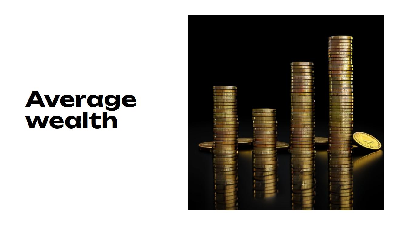
People have more coins! Tangible objects represented as graphs. Neat.
And another:
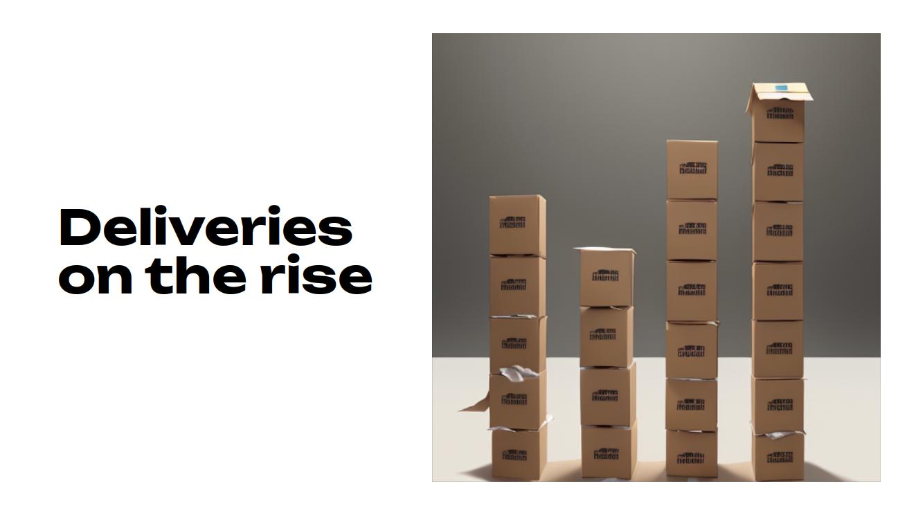
People waste a lot of paper and cartons with all the deliveries. Seeing cartons piled up is a lot more "visual" and perhaps more interesting.
By essentially putting the data and it's relationships in a way that's closer to reality and real, tangible things, I think we can do it a bit more justice than blank soulless bars.
These visualizations previously required meticulous crafting of images in image editing tools but this was done on the command line, by a machine.
So what happened here? This effect was achieved using Stable Diffusion with a thing called ControlNet. The gist of it is, that we now live in a world, where we can give computers reference images and they create new images by taking in text input and using that reference image as a constraint. It's pretty fascinating stuff and to be quite frank I'm clueless about how any of that works. It just feels like magic.
To learn about these things, I can recommend a couple of YouTube channels that I personally used: @SECourses and @OlivioSarikas. The first one for high paced explanations and insights into installing & operations and the second one for inspiration and creativity. You should be set in about a weekend. If not, just DM me a question.
Opportunity
Frankly, this is how I felt when this worked for the first time:
Pictures like these usually split the debate into two groups:
- Those that mainly see and pinpoint the flaws
- Those that see opportunity
While not essentially mutually exclusive, they don't overlap that much and if I had to pick a bunch to invest on, it would be the second one in a heartbeat.
It's true that this process is a bit wonky and gives weird results as shown in the previous image, but those artifacts should be easy to fix with enough time invested in the process. I'm going to spend more time figuring this out as it's relevant to some of my ongoing activities, if you're interested, follow me on Twitter where I'll share a lot more guides in a shorter format.
Essentially, what I'm more interested in is that this tool gives us the ability to design correct information, building up on tools we've already familiar with: standard charts.
More examples
Here are other examples, using different existing charts as inputs:
Here's the main cover image for this article. Can you guess the prompt?
Visualizations like these are technically correct and I'd argue also easier to look at.
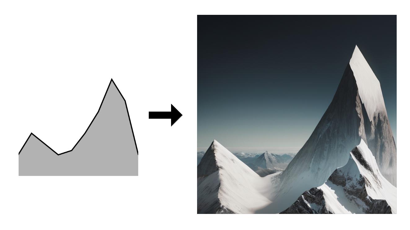
While not completely perfect, check this one out:
I've decided to include this one to highlight that you'll still need to pay attention to the accuracy of the generated graphs if you consider using this method in actual presentations. The generation fails sometimes and some models might behave like black boxes. Always double check. (Thanks to my friend Louis Hénault for highlighting this)
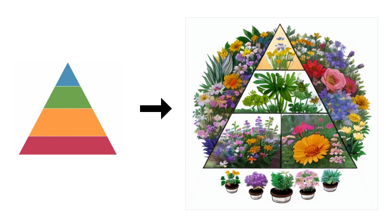
With a little bit more tweaking, this could be a gorgeous way to visualize stuff about plants in a hierarchical way. Neat.
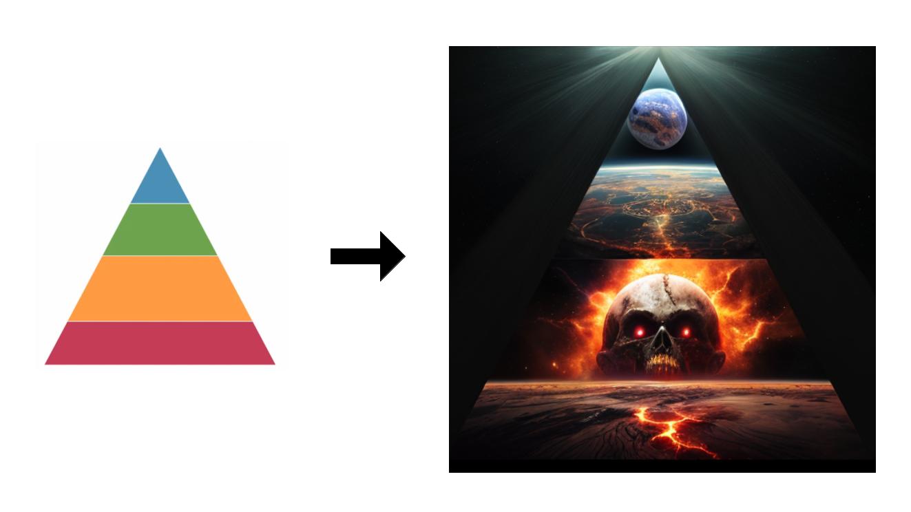
I let you guess the prompt for this one:
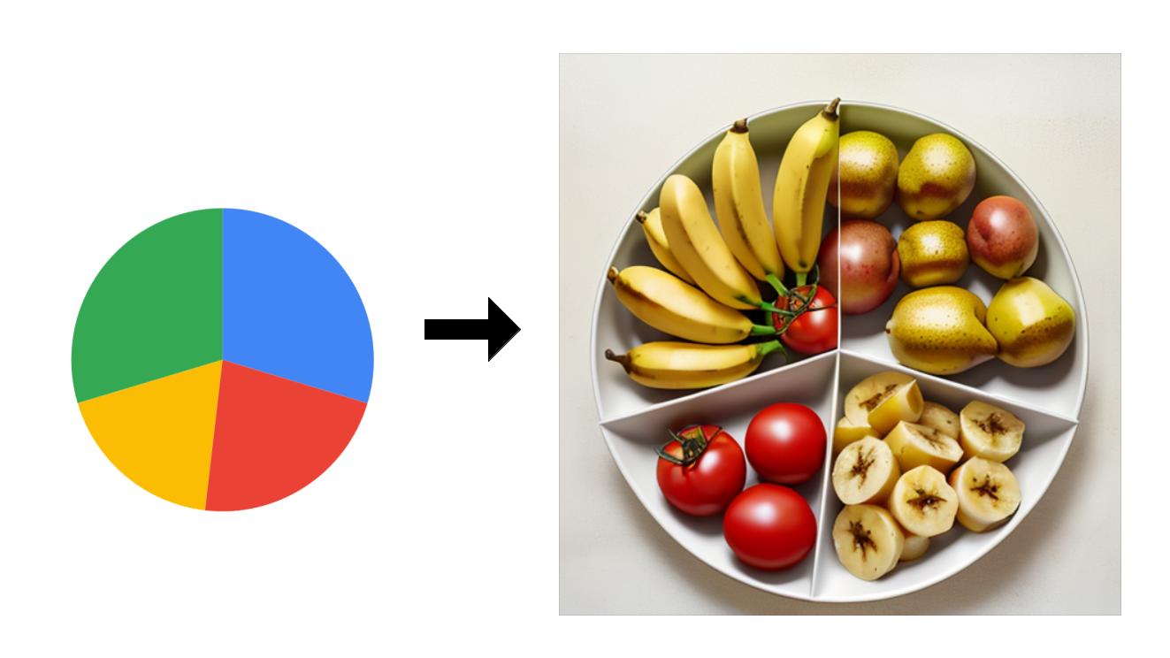
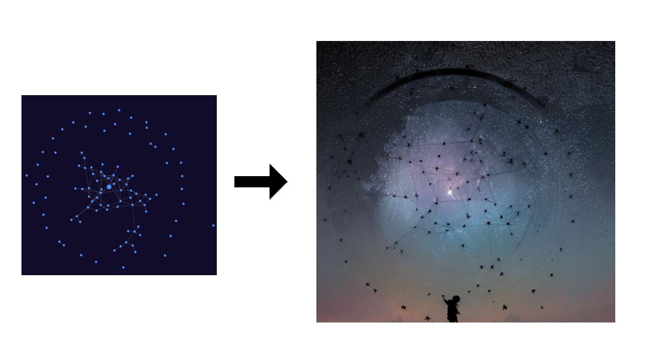
This technique doesn't require having solid shapes per se, here is one with a graph:
Using ControlNets and constraining the output image really feels like magic. Overlaying the two images shows a 100% match.
I think adding this to your toolkit could be a very interesting asset. Even though a little time must pass before these would be well received, we might just be getting there sooner than you know.
For now, when thinking of graphs, people usually refer to the standard ones, that have a bit of interactivity at best. Those are alright and will certainly keep being used in presentations and scientific papers. To convince a larger amount of people though, we need to find ways like these to make data more entertaining.
This "trick" can be extremely useful for things like info-graphics or bigger visualizations intended to engage rather than just inform. Stable diffusion can now be used from within image manipulation tools like Krita or even Blender and it works insanely well.
The possibilities are literally endless and I'll share some as I discover them.
Here's a final example. Lately I've been working a lot with graphs, their representation and how to use them best. I decided to pipe one of the graphs I generated into the same "pipeline" and got this pretty result:
Closing words
A picture being worth a thousand words, I believe that a data driven picture is worth a lot more since it doesn't only appeal to our "analytical" side. There are so many more possibilities I'm currently exploring and will share quite some more as soon as I get a better and more reliable understanding of the process.
One thing is clear though, creating this stuff is now at the reach of everyone. I'd like to thank the team at Stability AI for making this freely available. Thinking back, I would have never guessed, believed or imagined that these things could ever be possible let alone that I could do it. But here we are.
The more time passes, the more it becomes clearer that imagination is truly the only limiting factor. Perhaps with these tools we can focus more on creating rather than just producing, simply by making it easier to get started.